Collages are more than just a collection of images; they are visual narratives, personal expressions, and often, cherished memories brought to life. Whether you’re framing a family history, a travel adventure, a portfolio of artwork, or a themed collection of photographs, the way you present your collage significantly impacts its overall aesthetic and emotional resonance. While the images themselves are paramount, the humble picture mat plays a surprisingly crucial role in this presentation. Often overlooked, a well-chosen mat can elevate your collage from a mere arrangement of pictures to a sophisticated and impactful display. This guide will delve into the art and science of selecting the perfect mat for your collage, ensuring your visual story is told with clarity, harmony, and lasting appeal.
The Crucial Role of Matting in Collages
Before we dive into the specifics of choosing a mat, it’s essential to understand *why* it’s so important, especially in a multi-image format like a collage.
1. Visual Separation and Clarity
In a collage, multiple images compete for attention. A mat acts as a visual buffer, creating distinct spaces between each photograph. This separation prevents the images from bleeding into one another, allowing each piece to be appreciated individually before being understood as part of the whole. Without matting, a dense collage can appear cluttered and overwhelming, hindering the viewer’s ability to process the information presented.
2. Enhanced Focus and Emphasis

A well-selected mat draws the viewer’s eye towards the artwork. It creates a visual “frame” around each image, subtly guiding the viewer’s gaze and highlighting the most important elements of your collage. This is particularly vital when some images in your collage are more prominent or carry greater narrative weight than others.
3. Color Harmony and Tone Management
The colors of your images can range wildly in a collage. A neutral-colored mat can help to unify these disparate tones, creating a sense of cohesion. Conversely, a strategically chosen colored mat can complement or contrast with the dominant colors in your photographs, further enhancing the overall mood and impact of the collage.
4. Protection and Preservation
Beyond aesthetics, mats provide a physical barrier between your photographs and the glass of the frame. This is crucial for protecting your images from potential damage, such as sticking to the glass due to humidity or temperature fluctuations, and preventing direct contact that could lead to scratches or smudging.
Understanding Mat Types and Materials
The world of picture matting offers a variety of options, each with its own characteristics. Understanding these will empower you to make an informed decision.
Types of Mats:
- Single Mat: The most common type, consisting of a single layer of matboard. Ideal for simpler collages or when you want a clean, minimalist look.
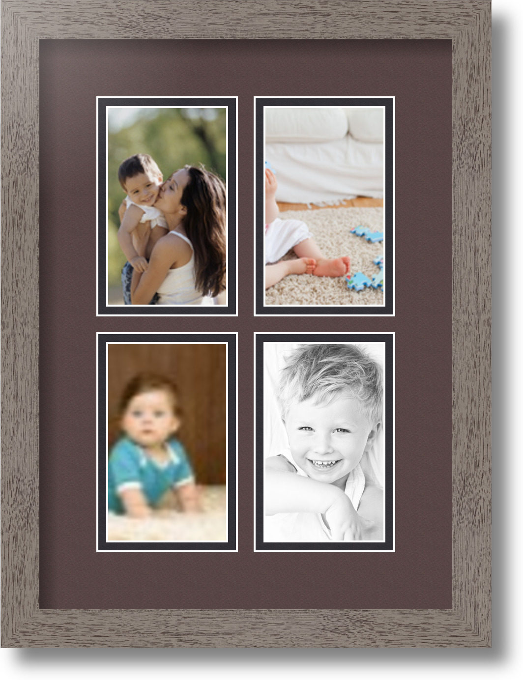
- Double Mat: Features two layers of matboard, one on top of the other. This creates a more pronounced border and allows for color contrast between the layers, adding depth and sophistication.
- Triple Mat: Incorporates three layers of matboard, offering even more depth and complexity. This is often used for very important or elaborate pieces.
- Beveled Mat: The edge of the mat is cut at an angle (typically 45 degrees), revealing the inner core of the matboard. This is the standard and most popular cut for a finished look.
- Reverse Beveled Mat: The cut is angled inwards, creating a slightly different visual effect.
- V-Groove Mat: A decorative channel or groove is cut into the top mat, running parallel to the opening. This adds an extra layer of detail and sophistication.
Matboard Materials:
- Paper-Based Matboard: The most economical option, typically made from wood pulp. While suitable for everyday framing, it’s generally not recommended for valuable or archival pieces as it can degrade over time and emit acidic byproducts that damage artwork.
- Alpha-Cellulose Matboard: Made from purified wood pulp that has been treated to remove lignin and other acidic compounds. This is a good mid-range option, offering better preservation qualities than standard paper-based boards.
- Rag Mat (100% Cotton): The archival gold standard. Made from 100% cotton fibers, these mats are acid-free and lignin-free, providing the highest level of protection for photographs and artwork. They are significantly more durable and will not yellow or degrade over time. For collages containing valuable prints or historical photographs, investing in rag mat is highly recommended.
Key Considerations When Choosing Your Collage Mat
Selecting the right mat for a collage is a more nuanced process than for a single piece of art. You need to consider the interplay of multiple images and the overall desired effect.
1. The Color Palette of Your Images
This is arguably the most critical factor. Your mat color should either complement or contrast harmoniously with the dominant colors within your collage.
- Neutral Colors (White, Off-White, Cream, Gray): These are the most versatile choices.
- White: Offers a clean, bright, and modern look. It makes colors pop and is excellent for images with vibrant hues.
- Off-White/Cream: Softer and warmer than pure white, these shades can be ideal for vintage photographs or collages with a more muted or nostalgic feel. They prevent the harshness that pure white might introduce.
- Gray: A sophisticated and modern choice. Lighter grays can provide subtle contrast without overpowering the images, while darker grays can create a dramatic and contemporary effect.
- Colored Mats: Use with caution and intention.
- Complementary Colors: If your collage has a dominant blue hue, a subtle orange or peachy mat could create visual interest. However, for a collage, it’s generally safer to stick to colors that are adjacent on the color wheel (analogous colors) or to use neutral mats that allow the image colors to speak for themselves.
- Dominant Color Tie-In: If a specific color is a recurring theme or a strong focal point across multiple images in your collage, a mat in a similar or slightly desaturated shade of that color can tie everything together beautifully.
- Avoid Clashing: Be very careful not to choose a mat color that fights with the colors in your photographs. A poorly chosen colored mat can make your images look muddy or garish.
Case Study: Travel Collage
Imagine a collage of vibrant beach photographs from a tropical vacation. Dominant blues, greens, and sandy yellows are present. A bright white mat would make the colors pop. Alternatively, a creamy off-white would lend a slightly softer, more relaxed feel. A subtle, sandy beige mat could subtly echo the beach theme without overwhelming the images. A bold primary red mat, however, would likely clash and detract from the serene atmosphere.
2. The Number and Size of Your Images

The density of your collage will influence the mat’s role.
- Dense Collages: If your collage is packed with many small images, wider mats between each opening are crucial for separation. A single mat might suffice, but a double mat can provide an even more defined separation, preventing the images from appearing too crowded.
- Sparse Collages: With fewer, larger images, you have more flexibility. You can opt for narrower mats or even a mat with larger, fewer openings. A double or triple mat could add a luxurious feel.
3. The Overall Mood and Theme of the Collage

The mat is an extension of your collage’s narrative.
- Formal/Elegant: Consider double or triple mats with neutral or muted colors, perhaps with a V-groove detail. Rag mat would add to the sense of quality.
- Casual/Playful: A simple single mat in white or a light, cheerful color could work well.
- Nostalgic/Vintage: Cream, sepia tones, or muted grays can enhance the vintage feel.
- Modern/Contemporary: Crisp whites, sleek grays, or even black mats can convey a modern aesthetic.
4. The Format and Orientation of the Collage
Will your collage be in a standard rectangular frame, a square frame, or a more unconventional shape? The mat’s design should complement the overall shape of the framed piece.
- Standard Rectangular: Most mat designs will work.
- Square: A balanced mat design that emphasizes symmetry is often best.
- Panoramic or Long and Narrow: Consider how the mat openings will be arranged to best fit this format.
5. The Type of Images (Photographs vs. Artwork)

While the principles remain similar, there are subtle differences.
- Photographs: Generally more forgiving with mat choices. Neutral mats are almost always a safe bet.
- Artwork (Paintings, Drawings): The artist’s intent and the artwork’s existing color palette should be paramount. Consult with the artist if possible. A mat that detracts from the artwork is a failure.
Designing Your Mat for a Collage: Practical Tips
Now that you understand the considerations, let’s look at some practical design elements.
Spacing: The Golden Ratio of Matting
Achieving the right spacing between images and between the images and the outer edge of the mat is crucial for a balanced look.
- Uniform Spacing: For a consistent and professional appearance, ensure the space between all adjacent images is the same. The space between the outermost images and the edge of the mat should also be considered.
- The “Rule of Thumb”: A common guideline for single mats is to have the bottom border slightly wider than the top border, and the side borders roughly equal to each other. However, in a collage, uniformity is often preferred between image openings.
- Visual Weight: Consider the visual weight of the images. If you have a particularly large or dominant image, you might want to give it slightly more breathing room.
The Importance of the “Reveal”
The “reveal” refers to how much of the mat is visible around each opening. In a double or triple mat, the reveal of the inner mat(s) adds visual interest. The width of this reveal should be consistent for a cohesive look.
Mat Cutting: Precision is Key
When commissioning custom matting, ensure the cutting is precise. Uneven cuts or poorly aligned openings can instantly detract from the professionalism of your collage.
Mat Color Combinations for Double/Triple Mats
- Classic Contrast: White outer mat with a black inner mat for a bold statement.
- Subtle Sophistication: Cream outer mat with a slightly darker cream or beige inner mat.
- Color Harmony: A neutral outer mat (e.g., white or gray) with an inner mat that picks up a subtle accent color from the collage.
- Monochromatic Depth: Using different shades of the same color for each layer.
When to Consider Skipping the Mat (with Caution)
While matting is generally recommended, there are rare instances where it might be omitted, particularly for very specific artistic intentions.
- Edge-to-Edge Collages: If the collage is designed as a continuous, uninterrupted visual flow with no distinct image boundaries, a mat might not be necessary. However, this is a highly stylized approach.
- Extremely Dense and Thematic Collages: In some experimental or abstract collages where the entire piece is meant to be a chaotic yet cohesive whole, a mat might be considered superfluous.
Caution: Even in these cases, the lack of matting can make the collage appear less professional and harder to view. It also eliminates the protective benefits of matting.
The Cost Factor: Balancing Budget and Quality

The cost of matting can vary significantly based on the material, complexity of the design (double/triple mats, V-grooves), and whether you opt for professional custom cutting or DIY.
- DIY Mat Cutting: Can save money, but requires precision tools and a steady hand. Mistakes can be costly.
- Pre-cut Mats: Available for standard frame sizes, but may not offer the customization needed for a collage.
- Custom Matting Services: The most expensive option, but guarantees precision and allows for complex designs. This is often the best choice for valuable collages.
Statistic: According to a survey by the Framing Industry Association, 70% of consumers believe that professional framing significantly enhances the perceived value of artwork and photographs. This highlights the impact of choices like matting.
Your Mat, Your Masterpiece
Choosing the right picture mat for your collage is an art form in itself. It’s about creating a visual dialogue between your images and their presentation, enhancing their impact, and ensuring their longevity. By understanding the function of matting, exploring different materials and colors, and carefully considering the nuances of your collage’s content and theme, you can make an informed decision that transforms your collection of images into a captivating and timeless piece of art. Whether you opt for the clean simplicity of a single neutral mat or the layered sophistication of a double or triple mat, remember that your mat is not just a border; it’s a crucial element in telling your visual story effectively and beautifully.